You’ve been working hard on your logo to make it look lean and mean, you’ve made sure the alignment is right, your sizes are well proportioned, your colours are well suited but there’s just something missing… When people design logos they sometimes forget the finish touches. I’m talking about dividing lines, details, pictograms, shapes. These graphic elements can make a plain logo look super cool. Here’s a few examples of great finishing details that you can try out on your logos.
Start designing your logo now
Dividing lines
Dividing lines are great details to add to your logos as they help to set two texts apart and add a little more dynamic and structure to your logo. Here’s a few examples that I’ve whipped up for you based on the dividing lines available in the logogenie logo design tools:
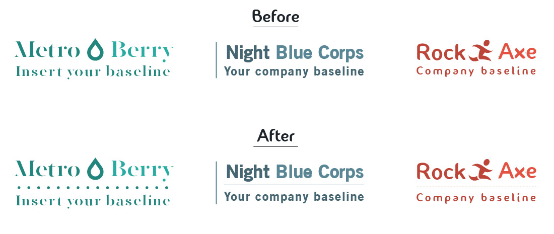
Notice that the « Before » line seems, well… A little dull ? That’s because there hasn’t been any dividing lines added to the composition. By adding dividing lines (and i’m not saying that you should do it all the time), you get a logo that seems more structured and graphically more appealing. It also helps separated your company name from your baseline. In most cases, you want your clients to see your company name before your baseline, this is also why the baseline is smaller in most logo designs. Adding a line in between the two texts makes it even cleared and really helps to set apart the importance of each text. It also adds a cool graphic element in the mix.
Bullets
Bullets are little details that you can add at each end of your company name and baseline. These graphical elements are great for adding personnality to your logo. Depending on what industry you’re in, you can find bullets that match your activity. It gives your logo another dimension and helps set the mood. If your logo is mainly text based, then adding bullet details will definitely « spruce up » your logo. Here are a few examples that you can compare with so that you can get a better idea of what i’m talking about:
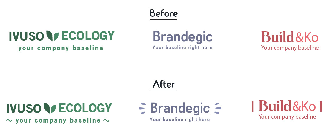
In the first logo, the design is enhanced by bullets that could represent roots or plants sprouting. In the second logo, dynamic bullets are used to give the design more energy as if to say, hey you, you need a brand ? We can help you out ! Two vertical lines are used in the third logo that act as walls on each side of the company name which evokes the building and construction domain. All of these little details tell a story and give your logo design more style and meaning.
Shapes
Using shapes in your logo is fun! Shapes create like a shell around an element and help focus the eye on the important information. Shapes are also great for structuring your logo. They can add some extra style to a composition that looks a little empty. Check out these cool designs that include shapes:
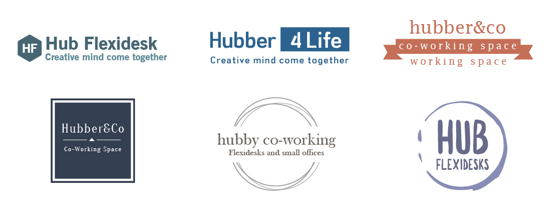
In the examples above, there are two ways in which shapes are utilised. In the first row, the shapes are used to englobe a set of letters or a sentence as if to say hey look at me. This helps the viewers to focus on a specific part of the logo like « for life » in the second sample of the first line. In the second row, the shapes surround the texts. In this set of examples, the shape become the element that structures the whole logo composition. These kind of logos are great for stricter, corporate type companies like accoutants, business managers, brokers, business advisors, etc…
What did we learn from this article?
We learnt that using shapes, bullets and dividing lines in logos is really cool! They help structure your logo, which is very important if you want your logo to look professional. They add a little extra graphical pazaz to the composition which makes it stand out a bit more. They are an alternative to using figurative icons. As a designer, I think it’s always interesting exploring these different apporaches and seeing what suits your company style best.
As in every article that I’ve written, I’d like to talk a little bit about our online design tool, logogenie affers a comprehensive online design solution for small business. We offer a huge range of logos including figurative icon logos, letter shaped icon logos, shape logos as mentioned in this article and also great plain text logos with super stylish fonts. Give it a try and let us know what you think by clicking on the link below
Author : Damien is a logo designer and graphics artist at logogenie. Damien has been in the design business for over 10 years and is a co-founder of logogenie.