![]()
Seasoned logo makers know that logos aren’t only graphics. They represent a brand, a symbol that serves as a “handshake” between companies and people. When you see an advertisement, you might not know the brand. However, a glance of the logo instantly creates a spark in your mind, associating that symbol with the brand. That’s how powerful logos are.
Owners of small businesses and startups, including freelance graphic designers, must appreciate the characteristics of a good logo to help them design a meaningful visual handshake that is memorable to many. Implicit in this statement is learning how to avoid designing a bad logo, which is essential to avoid undermining your brand’s success.
Taking Your Time with Logo Design: Why it Matters
Some small business owners think they only need an image, tweak it a bit, modify the color scheme, and add their brand name, and they could launch their business into the market.
Some might modify their existing logo in a jiffy, rearranging the design elements or changing the color scheme, and they think they can move forward.
Logos are a visual cue, a signal that, when people see it, they automatically recognize and remember your brand.
Brand recognition matters because it helps your company stand out. One of the best ways to ensure brand recognition is through a well-thought-out logo. People instantly associate the symbol (your logo) with your unique attributes – core values, principles, taglines, philosophy, vision, mission, and everything that makes your company a trustworthy brand.
On the other hand, poorly designed logos confuse people, making them think twice about doing business with you. After all, first impressions matter. You might want to know that 47 in 50 first impressions are design-related, underscoring the impact of a carefully planned business logo on consumer perception.
Taking time to design a logo that people can instantly recognize, remember, and associate with your brand doesn’t mean the process can drag on for several weeks.
No, it doesn’t have to be that way. Instead, business owners, graphic designers, and startup entrepreneurs must think deeply about aligning their logo design decisions with their brand’s identity, message, and target audience. It is worth remembering that a logo must be enduring and timeless, growing with your business.
Designing a logo requires continuous improvement over earlier versions, from sketching out ideas and seeking feedback to refining the design until you get it right. Unsurprisingly, seasoned logo makers can take up to four weeks to complete a project.
As graphic designer and art director Paul Rand once said, “Design is your brand’s silent ambassador.” Your logo is your company’s visual representative to the rest of the world. Hence, you will want to think well about making your logo the embodiment of your company.
![]()
Characteristics of a Good Logo Design
As the visual ambassador of your brand, your logo must have the following characteristics for it to succeed.
Simple
Simple logos encourage instant recognition, allowing customers to easily recognize it and instantly differentiate the brand in a crowded industry. These logos appeal universally. Everyone knows the brands associated with them, regardless of age, ethnicity, and culture.
More importantly, simple logos are versatile. You could print them tiny for product inserts and business cards or large for magazines and billboards, and people will still recognize them because there aren’t any complicated details that get lost when scaling.
Memorable
Effective logos communicate with the brain, allowing people to instantly recognize the brand, even with brief exposure to the symbol.
You might want to add a unique element (or elements) to your business logo. For example, Amazon’s arrow pointing from A to Z highlights its 350+ million product offerings.
Timeless
Successful brand logos have a timeless design. They aren’t trendy, preferring instead to feature enduring design elements.
Although companies can modify their logos to reflect the changing times, such symbols must retain their message and branding.
![]()
Characteristics of a Bad Logo Design
Negating the characteristics of a good business logo will give you the signs of a mediocre designed version. Let us dig deeper.
Complex
Two things can happen with very complex designed business logos. It can confuse consumers about what you’re trying to convey, making it more challenging to remember the brand.
More importantly, scaling the image down to size can reduce its impact because people won’t see the minute details.
Forgettable
Companies with generic logo designs (read, very common, run-of-the-mill) fail to capture people’s attention. They might offer exceptional products, but so does everybody else.
Others might “copy” and “tweak” the logo of a well-established brand. While some might consider it creative, doing so can invite lawsuits for copyright infringement. Moreover, it only confuses audiences.
Brand-inappropriate
Inappropriate logo designs can alienate target audiences. For example, would you create a fun and playful logo if you were a management service provider catering to top-level executives and seasoned professionals?
10 Examples of Badly Designed Logos
Appreciating good and bad logo designs helps you create the perfect logo. Learning from others’ mistakes can solidify your understanding. Here’s a look at ten examples of logo design gone wrong.
![]()
London 2012 Olympics
Although the logo still featured the 5-ring Olympic symbol, the other elements (odd color scheme and confusing shapes) created a logo that looked more like a jigsaw puzzle than a symbol of unity and sportsmanship.
![]()
Gap (2010 redesign)
The clothing and accessories brand ditched the all-caps “GAP” word inside a blue square for a sentence-case “Gap” outside the box. Consumers weren’t pleased, prompting the brand to revert to the original logo.
![]()
Tropicana (2009 redesign)
The beverage brand’s original logo had the word “Tropicana” in the traditional horizontal orientation. The company rotated it 90 degrees counterclockwise and saw its sales plummet 20%, fueling a hasty return to the original.
![]()
Kraft Foods
Kraft had an iconic logo with the word “KRAFT” inside an elongated hexagon. In 2009, the brand ditched the shape, added a confusing image (they said a smiley and swirls), and modified the text to “kraft foods,” all in lowercase. It backfired, and Kraft lost its identity, prompting the brand to return the original logo.
![]()
Pepsi (2008 redesign)
Coke’s nemesis isn’t doing that bad since it redesigned its all-red Pepsi-Co logo. Unfortunately, people weren’t impressed with succeeding design changes, especially considering the company spent a million dollars on a few subtle modifications.
![]()
MasterCard (2006 redesign)
Like GAP, MasterCard thought it was time to separate the text from the overlapping red-orange circles. Customers weren’t happy.
![]()
Yahoo! (2013 redesign)
The tech company’s attempts to refresh its logo fell short because it wasn’t exciting enough. Moreover, it looked oddly similar to the original except for a taller, recolored font.
![]()
Verizon (2013 redesign)
Putting a checkmark after the word “verizon" was too bland and simple for many telecom customers. Almost anyone can do that, suggesting the brand was too lazy to think about reinventing its logo.
![]()
Animal Planet (2008 redesign)
Animal Planet’s original logo featured an elephant silhouette in a green color scheme. They replaced it with an abstract elephant image in blue, confusing many.
![]()
RadioShack (2009 redesign)
Although RadioShack’s 2009 logo wasn’t bad, it wasn’t good either because people felt it was too generic.
Avoiding Bad Logo Design with the Right Fonts
Using the wrong font in your business logo can confuse people, leading to misconceptions. Check out these tips.
Clean, readable fonts are the best, especially if they reflect your brand’s tone. For instance, you can pick a modern sans serif if you’re a tech company. On the other hand, a classic serif should convey elegance to a luxury brand.
One or two fonts is enough to minimize confusing your target audiences. For example, you can have the first letter in cursive with the remainder in sans serif.
Test different font weights and sizes to ensure versatility. You will want readable fonts regardless of how you scale the logo.
Avoid fonts that are deemed cliché, like Papyrus and Comic Sans. While these fonts are iconic, they might undermine your brand’s professionalism.
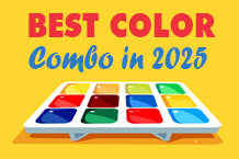
Avoiding Bad Logo Design with the Right Colors
Fonts aren’t the only elements you could mess up when designing a logo. Choosing the wrong color might send a different message because you are evoking the wrong emotion, too. We advise the following.
Leverage color psychology to reflect your brand’s unique identity and personality.
Understand that colors can have different meanings across cultures. Be wise in selecting a color that best represents your target audience.
Limit your colors to one or two to avoid overwhelming your audiences. Remember that colors connect to human emotions. Too many hues can be a headache.
![]()
Designing a Memorable Logo Online with Logogenie’s Tools
Small businesses and startups don’t need a dedicated team of graphic designers to create a logo. Cost-effective and reliable AI-powered tools, like Logogenie, are available online, empowering anyone to design professional logos online.
Logogenie offers many advantages to help you ace logo-making even with limited resources. It has a user-friendly interface. You can experiment with fonts, colors, symbols, and other design elements.
This platform has customizable templates to get your logo-making journey off to a solid start, while its instant previews can give you a real-time appreciation of your work. That way, you can tweak the logo and refine it as many times as you want until you’ve reached the perfect image for your brand.
It doesn’t matter if you have zero knowledge of logo design. Logogenie can help you create a logo that resonates with your target audiences and build credibility for your brand while avoiding the pitfalls of a poorly designed logo.
Conclusion
The best logos have a simple yet memorable and brand-appropriate design, allowing them to last many years amid trends and market changes. They are versatile, too, empowering businesses and startups to use the logos in different applications. Any logo that doesn’t showcase these attributes can never propel the business to success.
Taking time to design a logo is crucial. The good news is that AI online logo generators, like Logogenie, empower small businesses and startups to make the process more efficient. You can bet your logo will accurately represent your brand, allowing it to withstand the test of time.