What do Facebook, Adobe, Pinterest, Airbnb, and Beats have in common? Besides being the best in their respective fields, these brands only have letters as logos (of course, with a few design tweaks). They have simple yet very memorable and instantly recognizable logos, making them stand out in highly competitive markets.
Unsurprisingly, letter logos grew in popularity in 2024 and will continue to become the go-to logo design of many new brands in 2025 and beyond.
But how do you design and create the perfect letter logo to distinguish your brand and have it stand out from the competition? Besides having a reliable AI-powered online logo generator, you’ll need a few guidelines to design and develop a brand-boosting letter logo.
Join us in this two-part article exploring design ideas and tips to make a letter logo from A to G.
Logo Design Ideas and Tips for Logo Letters A to G
Thinking like a logo designer to design the perfect logo might sound impossible, especially for business owners and entrepreneurs with limited “creative” flair.
That’s the beauty of logo letters. They are simple, requiring only a few tweaks to deliver the right brand message. Of course, having Logogenie as your logo-making partner can make logo letter designing easy and fun.
As promised, here are some design ideas and tips for brands using the letters A to G for their logos.
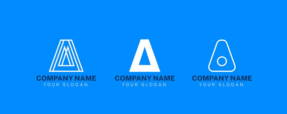
Letter A logo
A powerhouse of design potential, the letter A resembles a triangle favored for its stability, reliability, and strength. You can make “A” more alluring by thinking outside the “triangle” (not the box).
- Go the minimalist route by adding a negative space – for example, a bold “A” inside a square forms small triangles and other shapes. Just look at Adobe.
- Add color gradients or texture to “A” to give it a dynamic feel.
- Want an eco-friendly vibe? Try incorporating leaves, mountains, or other “natural” elements into “A.”
- Experiment with the crossbar of “A” by turning it into a dotted line or a swoosh (like Nike), or remove it altogether for a more abstract, modern twist. Did you know Logogenie can offer hundreds of possible letter A logo variations? Check it out.

Letter B Logo
“B” is a logo designer’s dream. Its symmetrical structure and curves make “B” an excellent letter logo for sophisticated or playful designs.
- Turn “B” 90 degrees clockwise and you’ll get eyeglasses – a quirky idea for fashion brands.
- Play with “B”’s two “bowls” by adding textures or layers. You could even try coloring one bowl metallic and the other matte.
- Integrate icons into the “bowls,” like a steaming mug for a coffee shop. Think of a symbol representing your brand and put it in the “B’s” bowl.
- Is your brand more traditional? Go with a serif “B.” modern brands can pick a sans-serif “B.” check out some of our letter B logos here.
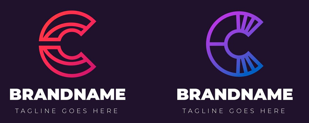
Letter C logo
Shouting creativity and openness, “C’s” unfinished form makes it an inviting letter to transform into a meaningful brand logo.
- Transform “C” into a rainbow by adding a gradient effect. How about a sunrise?
- Convert “C” into a swoosh, a moon, a wave, or any crescent shape. Remember, “C” is a designer’s playground because of its open structure.
- Pair “C” with another letter or shape to create a seamless, interlocking effect.
- Analyze “C’s” negative space and embed a star, arrow, or a more inconspicuous icon for additional intrigue. Take a look at our letter C logos right here.

Letter D logo
With lines and curves that can be commanding and soothing, “D’s” strong, semi-circular shape is perfect for brands that demand attention in their logos.
- Want a dynamic looking “D” that pops? Add 3D effects or shadows.
- Slice and dice the “D.” You can break the letters into parts. For example, you can make the half-circle’s inner line solid and an outlined curve on the other side. You could keep the curve solid and the straight line dashed or absent.
- Play with “D’s” negative space, like adding a flame or droplet icon to blend everything. Have a look at our selection of letter D logos here.

Letter E logo
Never underestimate “E’s” simplicity because this letter offers endless design tweaks. You can go sophisticated and stylish or vintage and rustic.
- Break “E’s” three horizontal lines into dots or dashes to give it a tech-inspired look.
- Turn “E” into a symbol for personal growth or home improvement by tweaking the letter as steps, ladders, or shelves.
- Mirror “E” to create a symmetrical, playful design.
- Add motion effects (i.e., trailing lines) to convey energy or speed. check out our selection of letter E logos.
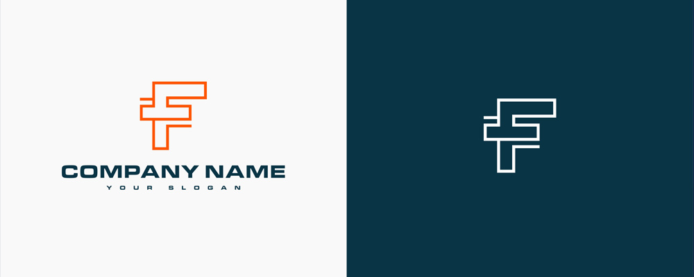
Letter F logo
Adaptable and quirky, “F” is perfect for brands wanting to stand out (who doesn’t?). It’s like “E” without the lower horizontal line. But that’s the key! You can play with this “open form” to create a brand-boosting logo.
- Look at “F,” and you could imagine a plant with the vertical line as the stem and the horizontal lines as leaves or petals.
- Break “F” into geometric shapes to create a futuristic vibe, perfect for tech startups.
- Want to convey a friendly vibe? How about adding curves to the “F” instead of the usual straight lines? It’s softer, too.
- Use the negative space between the two horizontal lines and integrate an arrowhead to symbolize growth and progress. See our selection of letter f logos.

Letter G logo
Many consider the letter “G” the alphabet’s golden child. Its circular base conveys continuity and unity, while its open end is a magnet for creativity. Add the short horizontal line, and you have a letter ripe for design tweaks.
- Are you a local brand planning to go global? You might want to update your logo design by incorporating the world map or a globe in your “G” logo, with the horizontal line forming an imaginary equator.
- Need a modern, edgy “G” logo? Play with the curves or add angular lines. That should give it a modern boost.
- Consider a gradient glow, where “G’s” open end features a glowing effect, giving the letter an inviting aura.
- Embed symbols or icons (try a gear or a key) into “G’s” open end. This hack is worth it. Browse through our letter G logos.
Things to Consider when Designing a Letter Logo
Did we inspire you with our letter logo design tips? Although there are many ways to design a logo, some things deserve a more thorough consideration.
Typeface
Since we’re talking about letter logos, typeface choice is crucial.
Script fonts are perfect for conveying a refined and creative image, while sans-serifs are more modern and straightforward. Slab serifs and block fonts give an edgy, in-your-face vibe, while bubble fonts are fun and offer a lot of creative tweaks. Of course, classic serif fonts are always dependable in communicating timelessness and a straightforward approach.
Typeface lines and weights (thickness) matter, too. Whatever font you use, ensure it’s readable while highlighting your brand’s unique personality.
Color choice
Colors have meanings. Use this to communicate your brand identity.
For example, subdued and subtle colors convey a caring or more natural feel, while bright and energetic hues are attention magnets and motivational. Monochromatic designs are effortless to reproduce across platforms and media.
On the other hand, gradients can be trickier to scale, although they convey innovation and modernity.
Background and use of negative space
Letters have negative spaces, like an open playground inviting a logo designer’s creativity. You can add meaningful shapes, icons, and symbols to create an eye-catching composition (check Adobe).
Consider the background, too. You can leave it white or blank or add another color (making your logo bicolor), gradient, detail, or texture.
Hidden meanings
Check out Pinterest’s logo. It might only look like a simple script “P” in a red circle. However, looking closer, you will notice the lower tip of the letter “P’s” vertical line is pointed, like a nail or pin. Look at the vertical line’s upper tip, and it’s somewhat rounded. This “P” features an abstract pushpin – showcasing Pinterest’s focus on “pinning” things on the platform.
Adding design elements to convey a hidden meaning isn’t always easy unless you know your brand inside out.
![]()
Bonus Tips for Creating the Perfect Letter Logo
Whether going for “A’s” allure, “B’s” boldness, or “G’s” genius, recognize that letter logos aren’t just about the letter. It’s about your brand’s story. Hence, your letter logo must resonate with your audience or prospective customers and reflect your brand’s unique identity and personality. Try these tips.
Know your brand inside out. Your letter logo must embody your brand’s personality, from quirky and fun to sophisticated, modern, or anything in between.
- Don’t be afraid to experiment with different typefaces and colors because these elements can convey your message, too.
- Think beyond the letter by incorporating icons, gradients, or textures to elevate the logo design. Logogenie can help with that.
- Always test your letter logos in different sizes, from a small favicon for web browsers and business cards to magazine spreads and billboard ads.
- Use a credible and powerful AI-driven online logo maker like Logogenie for endless fun and more productive letter logo making adventures.
Final Thoughts
Creating the perfect letter logo is easy and fun if you know the essentials and have a good idea of how to convert ordinary letters into brand-boosting logos that your audiences and customers will remember.
Keep on reading about letter logos with our article: creating the perfect letter logo, letters H to N
While letter logo creation is simple, designing it can take time (not to mention a ton of thought processes). Logogenie simplifies everything so you can get your letter logo designed in minutes and start communicating to the world about your brand.